
What Is Kinetic Typography and Why It Is One of the Most Powerful Tools in Visual Marketing
July 15, 2026
8
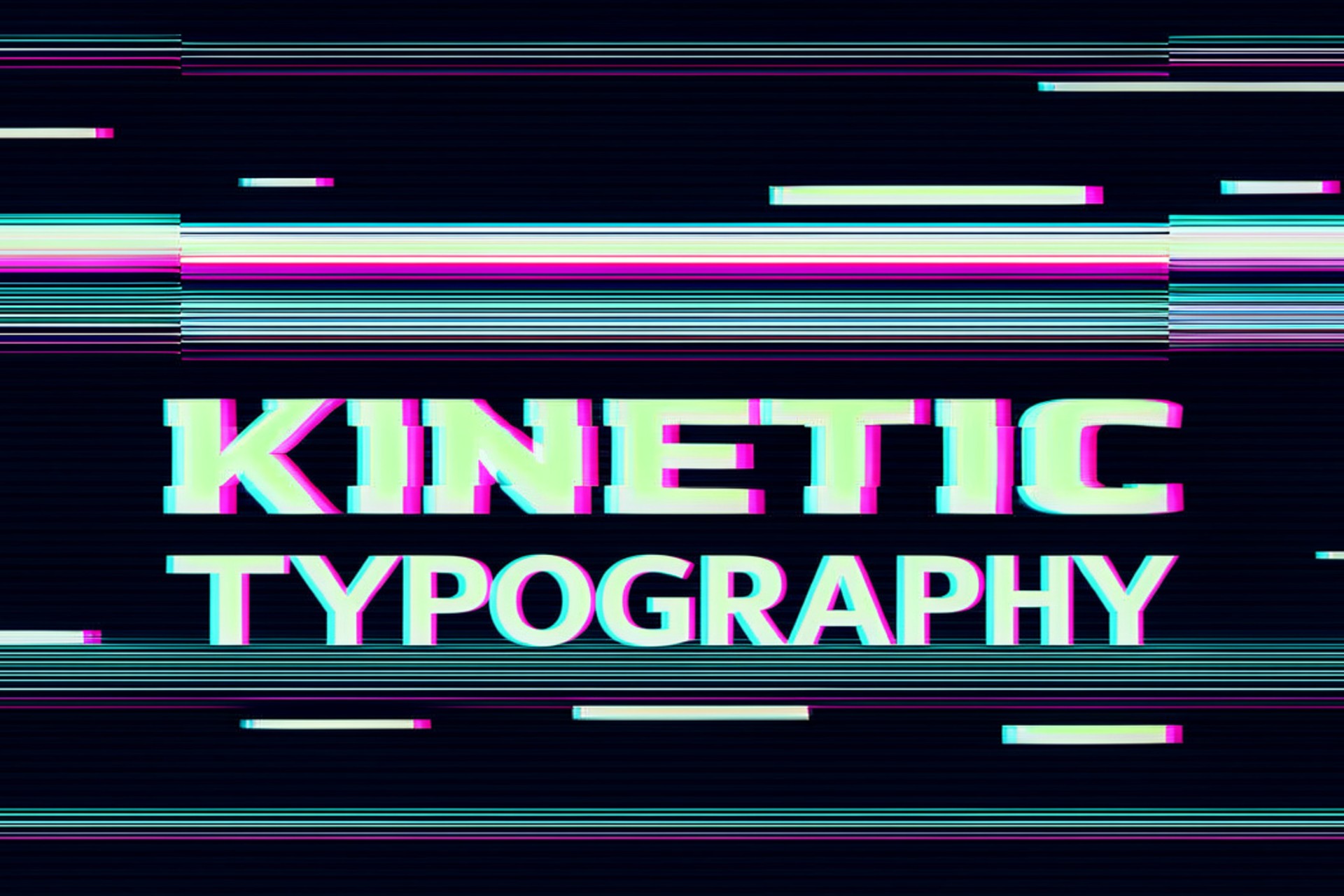
Words on a screen are easy to ignore. They compete with everything else in the visual field, they require deliberate reading effort, and in a scroll-driven content environment where audiences make engagement decisions in fractions of a second, static text rarely earns the attention it needs to communicate its message.
Kinetic typography changes this relationship between text and attention entirely. By adding movement, timing, and visual energy to the words themselves, it transforms written language from something that requires effort to read into something that is almost impossible not to watch. The message does not wait for the viewer to decide to read it. It arrives, it moves, and it lands before the viewer has consciously chosen to engage.
This is not a niche design trend or a production flourish reserved for high-budget brand films. Kinetic typography is one of the most widely deployed visual communication tools in contemporary brand marketing, appearing in everything from six-second social media bumper ads to full-length brand films, from app onboarding sequences to music videos, from digital signage to website hero sections. Its prevalence reflects a straightforward commercial reality: when text moves with intention and timing, it communicates more effectively than when it stands still.
Understanding what kinetic typography is, why it works at a psychological level, and how brands are using it to make their messages land harder is the starting point for building visual content that does not just look good but actually communicates.
What Kinetic Typography Actually Is
Kinetic typography is the technique of animating text to give it movement, timing, and visual energy that supports and amplifies the meaning of the words themselves. The movement is not decoration. At its best, it is a communication tool that uses visual motion to convey emphasis, emotion, pacing, and tone in ways that static text cannot.
The spectrum of kinetic typography ranges from subtle to dramatic. At the subtle end, individual words or characters appear with gentle fades or slides that give the text a sense of arrival without drawing attention to the animation itself. At the dramatic end, text explodes, contracts, spins, morphs, and moves with the kind of visual energy that makes it the primary visual event in the frame rather than a supporting element.
The application determines the appropriate approach. A brand film that uses kinetic typography to deliver a key message needs the text to feel intentional and emotionally calibrated. A social media ad using kinetic text to communicate a promotional offer in six seconds needs the text to be immediately readable and visually commanding. An app onboarding sequence using animated text to guide a new user through a feature needs the motion to feel helpful and clear rather than distracting or overwhelming.
What these applications share is the use of movement as a deliberate communicative choice rather than as aesthetic embellishment. The most effective kinetic typography is design where every motion decision serves a specific communicative purpose.
The Difference Between Kinetic Typography and Basic Text Animation
The distinction between kinetic typography as a purposeful communication tool and basic text animation as a production default is worth making explicitly, because confusing them produces content that moves but does not communicate.
Basic text animation applies movement to text as a formatting convention without considering whether the specific motion supports the specific meaning. The lower-third slide-in that appears in corporate video content because it is a template default, the subtitle fade-in that every video editing software applies automatically, and the bounce effect that someone chose because it was available in the effects panel are all text animations. None of them is kinetic typography in the meaningful sense because none of the motion decisions were made to serve the communication.
Kinetic typography starts from the meaning of the words and asks what motion would make that meaning arrive more powerfully. A word that describes something fast moves fast. A word that describes something heavy lands with weight. A key message that needs to feel definitive appears with the kind of visual authority that reflects its importance in the narrative. The motion is an interpretation of the meaning, not an addition to it.
Why Kinetic Typography Works: The Psychology Behind the Motion
The effectiveness of kinetic typography is not simply aesthetic. It is grounded in specific psychological mechanisms that explain why moving text commands attention and communicates more memorably than equivalent static text.
The Orienting Response
The human visual system is wired to detect and respond to movement. This evolutionary adaptation remains fully active in modern humans and activates automatically in response to motion within the visual field.
When text moves on a screen, the viewer's orienting response activates, directing attention toward the moving element before any conscious decision to engage has been made. This means kinetic typography earns attention at a pre-conscious level that static text cannot access. The viewer does not choose to read the moving text. Their visual system directs attention to it, and by the time conscious processing begins, the text is already being read.
In the social media context, where content is competing for attention in a high-speed scrolling environment, this pre-conscious attention capture is commercially significant. A kinetic text element that activates the orienting response stops the scroll before the viewer has decided whether the content is worth stopping for.
Dual-Channel Processing
Cognitive psychology research has established that information presented through multiple simultaneous channels is processed and retained more effectively than information presented through a single channel.
When kinetic typography is used with voiceover or music, the viewer is simultaneously processing the visual information of the text movement, the semantic information of the written words, and the auditory information of the accompanying sound. These three streams reinforce each other in ways that improve both comprehension and retention relative to any single channel alone.
This is why kinetic typography is so effective in brand films and advertising content that also includes voiceover: the combination of hearing the words, seeing the words move, and seeing the visual context creates a multi-channel message that is significantly more memorable than the same message delivered through any one channel independently.
Pacing and Emphasis Control
One of the most powerful capabilities of kinetic typography is the ability to control the pace at which the viewer receives and processes information and to use visual emphasis to direct attention to the most important elements of the message.
In a paragraph of static text, every word is simultaneously visible and theoretically equally available to the reader's eye. The reader determines what to focus on and in what order, which means they may read a headline and skip the supporting point, or reach the call to action without having absorbed the evidence that was supposed to motivate it.
Kinetic typography eliminates this self-directed reading order. Words arrive in the sequence the designer intended, at the pace the designer determined, with the emphasis the designer applied. The viewer receives the message in the order that was designed to make it most compelling rather than in the order their eye happened to travel across a static page.
How Brands Are Using Kinetic Typography in Visual Marketing
Social Media Video Content
Short-form social media video is the context in which kinetic typography has had its most significant commercial impact, because the specific constraints of social media viewing behavior create conditions where animated text is not just useful but often essential for communication.
When video plays silently in a social feed, the entire verbal content of the video is delivered exclusively through text. For brands producing social video content that needs to communicate a specific message in a sound-off environment, kinetic typography is the mechanism that makes the text readable, attention-holding, and communicatively effective rather than an afterthought that appears briefly in the corner of a video designed primarily for audio.
The brands generating the strongest engagement from short-form social video consistently use kinetic typography to ensure that the key message of each video is communicated through the visual channel as effectively as through the audio channel. The movement keeps the text engaging across the duration of the video rather than requiring the viewer to read static subtitles that compete with the visual content of the video itself.
Brand Films and Campaign Hero Content
In longer-form brand film content, kinetic typography plays a different role. Rather than being a sound-off communication necessity, it becomes a creative and emotional amplifier that elevates the impact of key moments in the film.
The brand film that uses kinetic typography to deliver its central message at the emotional peak of the narrative is using motion as a storytelling tool: the arrival of the words, their movement, and their relationship to the music and visual imagery creates a multi-sensory impact that static text or voiceover alone cannot produce.
This emotional amplification function is what makes kinetic typography a tool for building brand feeling rather than just communicating brand information. The words arrive in a way that is designed to make them feel inevitable, powerful, or emotionally resonant, and that designed arrival is what kinetic typography uniquely enables.
Digital Out-of-Home and Signage
Digital out-of-home advertising and digital signage are contexts where kinetic typography is particularly effective because movement is the primary mechanism for capturing attention in environments where multiple competing visual stimuli are simultaneously present.
A DOOH screen in a busy transit environment, a digital display in a retail space, or a digital billboard on a commuter route all exist in visual environments where static content has to compete with everything else for the viewer's attention. Kinetic text that moves with enough visual energy to distinguish itself from the static visual environment earns the attention that static text in the same placement would not.
The Design Principles That Make Kinetic Typography Work
Motion Should Serve Meaning
Every motion decision in kinetic typography should be made in service of the meaning of the words being animated. This is the principle that separates kinetic typography from arbitrary text animation, and it requires the most creative judgment to apply because there is no formula for how a specific word should move.
The designer has to understand what the word means, what emotional register it occupies, and what motion would make that meaning arrive most powerfully. A word like "impact" might arrive with the visual weight of a landing. A word like "suddenly" might appear with an instantaneous cut rather than a gradual fade. The motion is an interpretation of the meaning, not an addition to it.
Readability Is Non-Negotiable
Kinetic typography that is difficult to read has failed at its most basic communicative function regardless of how visually interesting the motion is. The movement should enhance the readability of the text by directing attention toward it and making it engaging, not undermine readability by making the text hard to follow or moving it too fast for comfortable reading.
The speed of text animation is one of the most common readability failures in kinetic typography. Text that appears and disappears before a normal reading pace can process it is text that has not been designed for communication.
Timing Relative to Audio Is Critical
In kinetic typography that accompanies audio, the timing of the text animation relative to the audio is one of the most important design decisions in the piece. Text that arrives ahead of or behind its spoken equivalent creates a desynchronization that breaks the dual-channel reinforcement effect that makes kinetic typography with audio more memorable than either channel alone.
For brands working with a social media marketing strategy that includes video content with both audio and visual text elements, the investment in properly timed kinetic typography rather than auto-generated subtitles is the difference between content that communicates through both channels simultaneously and content that presents two slightly desynchronized versions of the same message.
Consistency With Brand Identity
Kinetic typography exists within the broader visual identity system of the brand, and the motion design choices within it should reflect and reinforce the brand's visual character. A brand with a precise, minimal visual identity should use kinetic typography that reflects those qualities: clean motion, deliberate timing, and restraint. A brand with a bold, energetic visual identity can use more dynamic, higher-energy motion without creating tonal inconsistency.
The typography itself should be drawn from the brand's type system rather than selected independently for the animation context. This ensures that kinetic typography feels like the brand's visual identity in motion rather than a departure from it.
Common Kinetic Typography Mistakes That Undermine Communication
Using too many different motion types within a single piece of content creates visual noise that reduces rather than enhances communication. The variety of motion that feels dynamic during production feels chaotic during viewing, because the viewer's attention is constantly adapting to new motion behaviors rather than settling into a consistent visual language.
Applying motion to every text element regardless of its importance creates a hierarchy problem where nothing feels more important than anything else. Kinetic typography communicates emphasis through the contrast between elements that move significantly and elements that move subtly or not at all. When everything moves equally, the hierarchy that was supposed to direct the viewer's attention disappears.
Prioritizing visual interest over communication clarity is the underlying mistake that produces the most commercially ineffective kinetic typography. Motion that looks impressive in a showreel but makes the message harder to receive is motion that has been designed for the wrong audience. The viewer of a brand video is not evaluating the sophistication of the motion design. They are trying to understand what the brand is saying.
The Bottom Line
Kinetic typography is not a production upgrade. It is a communication upgrade. The brands using it most effectively are not using it because it looks impressive in a showreel. They are using it because it makes their message arrive differently, reach further, and stick longer than static text ever could.
Movement captures attention before the viewer has decided to give it. Timing controls the order in which the message is received. Emphasis directs the eye toward what matters most. These are not aesthetic advantages. They are communicative advantages, and in a content environment where audiences are making engagement decisions in under three seconds, the difference between a message that lands and one that gets scrolled past is often exactly this: one was designed to move, and one was not.
The question for any brand producing visual content is not whether kinetic typography is worth exploring. It is whether the content being produced is working as hard as it could for the audience it is trying to reach. If the answer is no, motion is usually part of the solution.
To explore how Foxtale Media approaches motion design and visual brand communication, visit the about page to learn more about the thinking behind our creative work, and reach out through Foxtale Media's branding and creative services when you are ready to build visual content that makes every word land harder.
Related Blog
October 6, 2026
8
In-House vs Outsourcing SEO: Which Delivers Better Results?

September 11, 2026
8
%201.svg)